First up is a card inspired by this week's ColourQ challenge. These colors are happy and bright so a birthday card was in order.

I used a Tim Holtz flower stencil and placed it on an angle on white cardstock and sponged the various ink colors onto the flower areas. I cut it off and added it to an Aqua Mist card base. Finishing touch was one of the Everyday Happiness dies and sentiment. So bright and cheerful and perfect for my aunt's birthday.

I've also been watching the videos in the Heat Wave online class this week. So many great projects but I'm finding the tips each teacher gives in the videos are so valuable.

This first card was inspired by Kristina Werner's Basics video for an partially embossed one layer card. I used my favorite go-to PTI Snowflake Flurries set to form a sunburst border in Aqua Mist, Dark Chocolate, and Hawaiian Shores. I embossed in gold some smaller and partial sunbursts as well as the sentiment. Love the look of regular inked images with the gold embossing. Forgot all about this design trick until I saw Kristina's video and sample project (which I can't seem to link here) which is so gorgeous and CAS.

And since I'm on an embossing roll, I made another card inspired by Kathy Racoosin's embossed resist lesson and Laurie Willison's PTI release gorgeous project below.
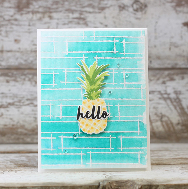
Unfortunately I've been using a few sympathy cards lately so I made another one to add to my stash.
I didn't have the Outline stamp set she used so I heat embossed the frame from PTI Fillable Frames Additions 2 in white on watercolor paper. I wanted them to overlap a little for a more organic look to the background. I feel like purples are appropriate for sympathy cards so I added water to smears of Royal Velvet, Winter Wisteria, and Amethyst Allure on my craft mat and painted over the embossed watercolor paper. I added a layer butterfly to the center like Laurie's pineapple but didn't have a small diecut sentiment to use so I stamped it in one of the frames and added rainstones in a diagonal from the sentiment to butterfly and up - kinda like Laurie did. But in hindsight it might have looked better if the sentiment and rainstones were in the same direction as the paintstrokes. Didn't really think of it until now. Oh well.

OK, that's it for me. I've got to pack as I am headed out for the weekend to meet up with my sister and her family at an amusement park. Hope you have a great weekend and stay cool. Thanks for popping in.
Love all the beauties on your post today. Really especially love the first card--a clever and pretty way to use the colors of ColourQ this week. Thanks so much for playing along.
ReplyDeleteLovely, lovely cards Sherrie! Really like your MIM card in the purples...SO pretty!! 😊
ReplyDeleteLovely, lovely cards Sherrie! Really like your MIM card in the purples...SO pretty!! 😊
ReplyDeleteFabulous collection of cards Sherrie! I like the design and pretty flowers on your ColourQ card. Thanks so much for joining us this week!
ReplyDeleteSo many wonderful cards Sherrie...love them all! Your first card is my favorite, just love how you used this weeks sweet colors. Thank you so much for playing along with us at ColourQ!
ReplyDeleteSherrie, all three cards are just lovely. Debated taking the Heat Wave class but with SAF later this week, I wasn't sure I'd find time now to participate. Maybe I'll take it this Winter if you confirm it's worth it. 😀
ReplyDeleteAll cards are awesome :)
ReplyDeleteVery pretty card, Sherrie, Love your work with the stencil! So glad to see a regular at the colourQ, thanks for playing!
ReplyDelete