Showing posts with label Beautiful Butterflies. Show all posts

Tuesday, December 12, 2017

CASology #275 Gray

🎶.....when skies are GRAY. You'll never know dear, how much I love you....please don't take my sunshine away.  ðŸŽ

That song came to mind when I saw this week's CASology challenge: GRAY.  Its a song I used to sing to my daughter (now 12) a lot.


I wanted to use a monochromatic gray color scheme so I paired PTI Soft Stone with Simon Says Stamp Smoke Gray. I die cut the PTI butterflies out of the Soft Stone. Sentiment is from PTI Pen & Ink (one of my new favorites!) which I still had handy from last week's card. 


Be sure to check out the GRAY cards made by my awesome DT friends: 

Guest Designer:  Mary B.

Hope to see you in our gallery! Have a great week! 

Wednesday, June 29, 2016

CAS(E) & ColourQ

Happy Wednesday! So happy I got some crafty time in today while the girls were at camp. Wanted to share a card I made inspired by this week's CAS(E) This Sketch and ColourQ challenges.


I'm building up my stash of Thank You cards. For my card I used a swirlie and butterfly from the Catherine Pooler Beautiful World collection. I added an extra butterfly from PTI Beautiful Butterflies, some enamel dots, and sentiment from PTI Thank You Kindly. 

Thanks for popping in! Have a great week. 

Tuesday, March 29, 2016

CASology #191 WASHI

Happy Tuesday! We have a fun one for you at CASology this week! WASHI! We all probably have more WASHI than we will ever use or even care to admit to having. I have tons of it but have been using it more often in my everyday note taking, list making, and bullet journaling. 


For my card I created a striped butterfly out of washi. As pictured below, I created the striped pattern by alternating gold and silver washi tape on a scrap piece of card stock and then die cut the butterfly out of it. I also used washi tape for the PTI Swoosh sentiment as well. Before adhering the butterfly and sentiment, I scored part of the card base on a diagonal to line up with the washi tape lines in the butterfly. Scoring adds interest while preserving white space. Check out Laurie's PTI Make It Monday video this week for great ideas on using score lines for additional detail and texture! She always uses score lines on her CAS projects in such interesting ways. 


Check out the rest of the DT interpretations of WASHI for more ideas on how to use up your washi stash. Can't wait to see what you come up with! Have a good week!

Wednesday, March 9, 2016

Spring Has Sprung!

Hi friends! Spring has finally come here in NJ and its all of a sudden hard to stay inside. Did get a chance to make two cards yesterday.

First card is for a new challenge blog called Inspired by All The Little Things. Such a pretty inspiration photo no? Just the kind of tea party I'd love to attend!


I was inspired by the golden edge on the tea cups and as well as the pretty decorated cookies. 
I stamped PTI Circle Scribbles in Gold Delicata ink. I layered die cut butterflies - bottom in Sweet Blush pink and the top in PTI bitty dot vellum (so sturdy and thick!). Added a few pearls to the center to cover up the foam tape. 


Second card is inspired by the bright colors at ColourQ this week. I decided to use the bright colors in small doses. I masked a circle and sponged in Heidi Swapp Mint in for a background. Stamped a flower from PTI Be in Melon Berry and Simply Chartreuse. Sentiment is from Thank You Kindly in Memento Danube Blue. I added some striped Melon Berry patterned paper on both sides for some added color. 


Hope Spring has reached your neck of the woods! Thanks for popping in!

Monday, February 15, 2016

PTI Anniversary Part 2

Cold weekend here in NJ! Popping in quick to share a couple of cards.


First card I made for the PTI Anniversary Sampler Square challenge. To make this easier, I used my favorite colors for my 9 different techniques. The whole idea was intimidating quite honestly but it was a lot of fun and reminded me of some of the techniques to use.


Closeups of the squares:


Bottom row (L to R): Stamping & Perfect Pearls, Heat embossing and ink blending, stamping white then color


Middle row (L to R): Texture kissing, heat embossing in color, dry embossing


Top row (L to R): Die cut, tone on tone stamping, water coloring over heat embossed image

While I was working on my squares, my daughters were making cards of their own using the Color Pop Fortune Teller. How fun was that! They absolutely couldn't resist playing along. And I was kinda scared to let them loose with all my craft supplies but they had a blast. Once they picked out their colors, they flipped through my binder of PTI card sketches to get them inspired and off they went searching through my stamp sets and dies.

This card was made by my daughter Sierra -


She selected Royal Velvet, Summer Sunrise, and Melon Berry with the Fortune Teller. She used Snowflake Flurries and the Swoosh die to make her card. Pretty cute right! So proud of her. 

Stay warm. Check out my post HERE featuring my daughter Sydney's card. 
Thanks for popping in. 

Sunday, January 17, 2016

Create Along With Us January 2016


There were SO many fabulous DT creations with the last PTI release. But I was very inspired by this particular one by Lizzie Jones to create a card for the PTI Create Along With Us challenge:


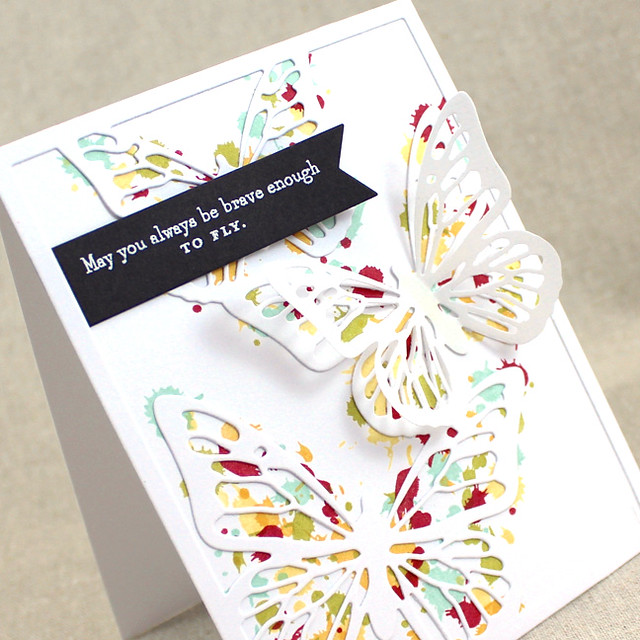
I loved how the dots of multicolored splatter were peeking out beneath the butterflies. Since I don't have this pretty little cover plate yet, I was inspired to create this card using the largest Beautiful Butterflies die as my focal point. I also used Drips and Dribbles to create the background in the same fun color combo Lizzie used.


I used foam tape to adhere the center of the butterfly on top of the dot splatters and pushed the wings back a little bit for added dimension. Sentiment is from Perfect Pairing. Love how it turned out...I'm definitely doing this again. Can imagine a set of cards with different color combinations....fun! 


First signs of snow here in NJ today....its a little long overdue but I'm still not ready for it. Hope you are having a great weekend. Thanks for popping by!

Monday, October 26, 2015

Pearlized Blending


Hi! Sharing two cards I made this morning while waiting for the repair man to come...it's the first time I've been excited by the 4 hour window they gave me! 

I played along with the PTI Make It Monday challenge - Pearlized Blending. I love the effect of Perfect Pearls but always forget to use them. Thanks Lizzie for the reminder! 

For my card I masked off a strip on my white panel and heat embossed some PTI Beautiful Butterflies in white. Then I blended Tropical Teal ink along the bottom, Hawaiian Shores in the middle and Aqua Mist toward the top for an ombre look. The I rubbed the masked area directly with Versamark ink and applied Perfect Pearls over it. Next time though I will blend the ink darker because the pearls lighten the overall color a lot. 


Seriously these photos don't do this effect justice. The masked portion is simply gorgeous - shiny but not TOO shiny. Love this look! 


Second card is inspired by the CAS(E) This Sketch challenge this week.


I stamped the greeting from Wet Paint Holiday and added some holly and ivy from the new PTI Spruce and Sprigs. I added a strip of PTI Candy Prints patterned paper on the top and bottom of the panel before attaching to Pinefeather card stock. 


Thanks for stopping by!

Sunday, August 2, 2015

Background of Wings


Background Check is the latest in the lineup of classes at Online Card Classes. Haven't had a chance to watch the videos this week but have been looking at the beautiful creations in the each day's lessons. Day 4's lesson was all about backgrounds using die cut techniques and reminded me of the tone-on-tone look that I love so I used it to make this card - 


I've had this card design for a sympathy card swirling around in my head for a while now. This week's CASology cue word is WINGS so I had one of my girls die cut two butterflies (love it when they want to help!) in Enchanted Evening which I adhered directly on Enchanted Evening card stock for the tone-on-tone look. Not a big fan of birds so butterfly wings are the only ones I got for this challenge. 

I was inspired by the colors at Colour Me (Hi Team Hayley!!) this week which I thought would be perfect for a subdued sympathy card. Love the little pop of color with the Berry Sorbet sentiment banner popped up with foam tape for some more subtle dimension. And the final classic touch were the pearls to finish off the color combination. Here's a closeup of the larger butterfly...lighting was a little wonky when I took the photo so  the color is a bit off from the original. 


 Thanks for checking in! Gorgeous weather this weekend. Went kayaking for the first time yesterday - fun stuff! Hope you are enjoying the weekend too!

Friday, January 30, 2015

Clean & Simple 4


I'm really enjoying this class this week. Lots of ideas brewing in my head. I don't have necessary supplies for a few of the more complicated techniques but there's still many other things left to try. 

First card uses the faux embossing technique demonstrated by Yana Smakula.  I wanted to make a masculine card with the fun die cuts from PTI Handy Hardware. I used Rustic White cardstock layered on an adhesive sheet to make gluing the pieces easier. Can't imagine adhering them with liquid adhesive. 


Simple sentiment on a chocolate banner. I LOVE how this look and I think this will be a technique I use again and again! 


Next card uses the Layered Inking technique that Jennifer McGuire demonstrated. I inked a piece of white cardstock completely with Hero Arts Soft Stone ink (direct to paper) and then blended Heidi Swapp dark blue ink along the edges. Love the 

Now here's where I cheated. The technique called for the butterflies to be stamped in Versamark ink and after some time, the Versamark ink would react to the dye ink and lighten on the background and appear white. But somehow this part didn't work for me...the butterflies never appeared. Not sure why but the technique worked for others in the class so maybe I did something wrong. 

I cheated by stamping the butterflies in white to achieve the same effect. 


This pretty background seemed perfect for a sympathy type card so I partially die cut a vase and stamped the sentiment beneath and adhered the strip with foam tape so that it floats above the dark sky and butterflies. 


So that's it for me now. Hoping to get some crafting time in tomorrow. Have a great weekend friends and thanks for stopping by! 

Saturday, September 27, 2014

CASology:Flutter


Quick share with you tonite. Working all day today and I'm exhausted but tomorrow promises to be even busier so wanted to get this in before deadline Monday. 

Wish I was a little more novel on my take of CASology challenge cue FLUTTER. First thing I thought of was butterflies of course and didn't take it any further than that. 


I wanted to simulate movement so I die cut three colorful butterflies from Beautiful Butterflies and also die cut the same out of the white card base so the colorful ones could be inlaid into the card stock.  Finished it off with a Wet Paint sentiment. 

Hope you are having a great weekend. Thanks so much for stopping by!