Showing posts with label onlinecardclasses. Show all posts

Friday, July 15, 2016

Happy Friday!

Hello friends! Happy Friday! Feels like its been a LONG week but I ended it with some crafty time so all is good.

First up is a card inspired by this week's ColourQ challenge. These colors are happy and bright so a birthday card was in order.


I used a Tim Holtz flower stencil and placed it on an angle on white cardstock and sponged the various ink colors onto the flower areas. I cut it off and added it to an Aqua Mist card base. Finishing touch was one of the  Everyday Happiness dies and sentiment. So bright and cheerful and perfect for my aunt's birthday. 


I've also been watching the videos in the Heat Wave online class this week. So many great projects but I'm finding the tips each teacher gives in the videos are so valuable. 


This first card was inspired by Kristina Werner's Basics video for an partially embossed one layer card. I used my favorite go-to PTI Snowflake Flurries set to form a sunburst border in Aqua Mist, Dark Chocolate, and Hawaiian Shores. I embossed in gold some smaller and partial sunbursts as well as the sentiment. Love the look of regular inked images with the gold embossing. Forgot all about this design trick until I saw Kristina's video and sample project (which I can't seem to link here) which is so gorgeous and CAS. 


And since I'm on an embossing roll, I made another card inspired by Kathy Racoosin's embossed resist lesson and Laurie Willison's PTI release gorgeous project below. 
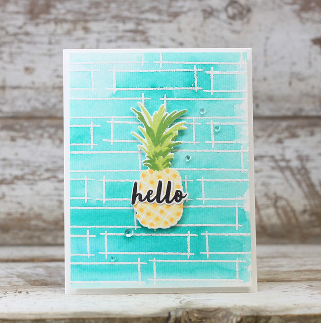

Unfortunately I've been using a few sympathy cards lately so I made another one to add to my stash. 
I didn't have the Outline stamp set she used so I heat embossed the frame from PTI Fillable Frames Additions 2 in white on watercolor paper. I wanted them to overlap a little for a more organic look to the background. I feel like purples are appropriate for sympathy cards so I added water to smears of Royal Velvet, Winter Wisteria, and Amethyst Allure on my craft mat and painted over the embossed watercolor paper. I added a layer butterfly to the center like Laurie's pineapple but didn't have a small diecut sentiment to use so I stamped it in one of the frames and added rainstones in a diagonal from the sentiment to butterfly and up - kinda like Laurie did. But in hindsight it might have looked better if the sentiment and rainstones were in the same direction as the paintstrokes. Didn't really think of it until now. Oh well. 


OK, that's it for me. I've got to pack as I am headed out for the weekend to meet up with my sister and her family at an amusement park. Hope you have a great weekend and stay cool. Thanks for popping in. 

Sunday, August 2, 2015

Background of Wings


Background Check is the latest in the lineup of classes at Online Card Classes. Haven't had a chance to watch the videos this week but have been looking at the beautiful creations in the each day's lessons. Day 4's lesson was all about backgrounds using die cut techniques and reminded me of the tone-on-tone look that I love so I used it to make this card - 


I've had this card design for a sympathy card swirling around in my head for a while now. This week's CASology cue word is WINGS so I had one of my girls die cut two butterflies (love it when they want to help!) in Enchanted Evening which I adhered directly on Enchanted Evening card stock for the tone-on-tone look. Not a big fan of birds so butterfly wings are the only ones I got for this challenge. 

I was inspired by the colors at Colour Me (Hi Team Hayley!!) this week which I thought would be perfect for a subdued sympathy card. Love the little pop of color with the Berry Sorbet sentiment banner popped up with foam tape for some more subtle dimension. And the final classic touch were the pearls to finish off the color combination. Here's a closeup of the larger butterfly...lighting was a little wonky when I took the photo so  the color is a bit off from the original. 


 Thanks for checking in! Gorgeous weather this weekend. Went kayaking for the first time yesterday - fun stuff! Hope you are enjoying the weekend too!

Friday, January 30, 2015

Clean & Simple 4


I'm really enjoying this class this week. Lots of ideas brewing in my head. I don't have necessary supplies for a few of the more complicated techniques but there's still many other things left to try. 

First card uses the faux embossing technique demonstrated by Yana Smakula.  I wanted to make a masculine card with the fun die cuts from PTI Handy Hardware. I used Rustic White cardstock layered on an adhesive sheet to make gluing the pieces easier. Can't imagine adhering them with liquid adhesive. 


Simple sentiment on a chocolate banner. I LOVE how this look and I think this will be a technique I use again and again! 


Next card uses the Layered Inking technique that Jennifer McGuire demonstrated. I inked a piece of white cardstock completely with Hero Arts Soft Stone ink (direct to paper) and then blended Heidi Swapp dark blue ink along the edges. Love the 

Now here's where I cheated. The technique called for the butterflies to be stamped in Versamark ink and after some time, the Versamark ink would react to the dye ink and lighten on the background and appear white. But somehow this part didn't work for me...the butterflies never appeared. Not sure why but the technique worked for others in the class so maybe I did something wrong. 

I cheated by stamping the butterflies in white to achieve the same effect. 


This pretty background seemed perfect for a sympathy type card so I partially die cut a vase and stamped the sentiment beneath and adhered the strip with foam tape so that it floats above the dark sky and butterflies. 


So that's it for me now. Hoping to get some crafting time in tomorrow. Have a great weekend friends and thanks for stopping by! 

Thursday, January 29, 2015

Border Gap Die Cutting


Hello friends! I'm taking the latest Clean & Simple card making class at onlinecardclasses.com this week and having some fun getting inky with the new techniques I'm learning. Kristina Werner, Jennifer McGuire & their special friends are making me bring out the big guns, the stuff that rarely sees the craft light in my room - distress inks, blending tools, stencils, and even the big Tim Holtz craft mat! Have to tell you that I'm in love with the look of ink blending...just need to practice a bit more so that I get a smooth and even finish and a better gradient look. 

On Day 2, Kristina shared the border gap die cutting technique. Here's my birthday card - 


I used a couple of bright distress inks to form the colored portion under my copic-colored cake. To give it a little more sparkle, I used my new gold wink of stella for the candles and heat embossed the brown cake topping in clear to give the chocolate ganache a more realistic look. 


But my favorite new trick I learned was to use big strips of foam tape (or even an entire layer of fun foam) to make the top card panel stand out. I would have used foam squares in the past and after a while the card panel would be uneven and when the card is flattened for an envelope the panel would be distorted. Now with the big strips of foam tape...looks nice and even for the long haul. 

And Post-It tape...LOVE it! Makes masking so much easier. Gonna have to get both foam tape and post-it tape in large quantities next time I'm shopping. 

ETA - Also entering this into the CASology Birthday challenge. That was the whole reason why I picked the cake in the first place. Meant to do that but got distracted getting the kids ready for school this morning! 


That's all for me now. Will have more to share from this class soon. Thanks for taking a peek!

Wednesday, May 7, 2014

Three More Cards

I have three more cards I want to share with you this evening from my marathon craft night yesterday.

First card is a thank you card inspired by the monochromatic color scheme at Colour Me this week.


I wanted to pair the cherry cobbler with grays as my neutral though my first instinct was to use kraft. I die cut two large banners out of patterned paper from X, offset and cut them to make room for my white embossed sentiment. I added a few cherry enamel dots because well, I love them!


For my next card I used the relatively new PTI Sketched Stars dies in Aqua Mist and Enchanted evening. I paired it with the dotted star trail in Harvest Gold from Super Stars and added the sentiment from Simple Stars. Card design inspired by this week's sketch at CAS(E) This Sketch.


My final card is from Watercolors for Cardmakers Day 1 using the Vibrant Watercolor Wash Background technique demonstrated by Laura Bassen. She uses an acrylic block to apply the watercolor to her paper. I loved the way she had a white border around so I used a smaller block and applied the color just to the center. Sentiment is from PTI Half and Half and card base is PTI Tropical Teal which I haven't used much yet.


That's it for me tonight. Thanks for stopping by!

Itching!

LOL!

No, not itching like I have a rash, or even worse lice. I was itching to get back to creating after a week break! This past weekend was great. We had family in town over the weekend to celebrate my twin daughters' First Holy Communion and it was crazy busy here getting ready for the big day and guests. When the last of my family finally left yesterday, I spent the day getting caught up on laundry and getting the house back in order. Whew! I don't know about you but I can't enjoy my craft time until most of my household chores and responsibilities are taken care of first.

So I was in heaven when I finally got into my craft space last night and spent a few hours playing along with challenges, catching up on my favorite tv shows, and getting back into the groove.


First card I want to share is for the CASology challenge METAL this week. For my card I wanted to use some metal scrapbook embellishments I've been holding onto for years. Really, its been MANY years since I got these!

I paired the metal footprints from Making Memories with PTI Winter Wisteria for a baby card I will need this summer. I used Circle Scribbles as my single focal point to highlight the footprints and stamped the simple sentiment in a metallic silver ink.


Next card was inspired by the ColourQ color scheme this week. I used an old Papertrey anniversary sketch for my design and stamped images from Ruby Rose along the sentiment banner.


This third card is inspired by the Papertrey Color Play palette for May.


These colors seemed perfect for the Meadow Greens set.


And my last card was inspired by the online class I am taking Watercolors for Cardmakers. I am a bit behind (its Day 3 currently) but I decided to take my time watching the videos and trying the techniques before I move onto the next day.


Day 1 was all about creating Watercolor Backgrounds. My card is based on the technique demonstrated by Kristina Warner - Stamped Embossed Resist with Watercolor Wash.


I heat embossed PTI Simple Stripes in white and then watercolored a diagonal rainbow background over it (similar to Kristina's). I used the Simon Says Stamp Absolutely die and stamps for a simple sentiment banner across and added a few Kelly Purkey sequins. I mounted the watercolored panel on a dark purple Memory Box card base for strong contrast.

I have a few more cards to post later but wanted to share a picture from this weekend of my two girls.... I am struggling with them being 8 already and reaching this milestone in their lives. Getting old so fast.....


Thanks for taking time to stop by. Hope you are having a great week!

Wednesday, March 26, 2014

Card Trio

Thanks for all your kind words about my Blog Hop card yesterday. I had fun playing with glossy accents since its a departure from my usual style. I had a blast looking at everyone's shiny creations - TONS of inspiring stuff out there!

Sharing three cards with you today. First card is for the CASology challenge. As soon as I saw the cue card LUCKY, I knew I wanted to use patterned paper from the Echo Park Well Played collection. I used my Tipped Topped dies to highlight the card themed paper. Sentiment is from AMuse. Tried to keep the design and colors simple.

I did struggle with this card a bit because I wasn't sure when I could really use a card like this. I try to make cards that I can really use or send to Operation Write Home. However, my eldest daughter thinks this card will be perfect to use when we have a friend who wins the lottery. LOL. As if this happens frequently! Anyone want to win the lotto and get this card in the mail?


Next card is a thank you card which uses the Triple Threat colors at Dynamic Duos this week.


I kept this card simple by building the elements around a Half & Half die cut in Autumn Rose. I dry embossed horizontal stripes on it and cut it in two so I could heat emboss the sentiment in the middle. I layered some Ruby Reprise flowers around the sentiment and added Aqua Mist patterned paper leaves.


Last card uses a masking technique I picked up in the Clean and Simple 3 class. I used my new Wet Paint set and Mini Blooms in the pretty colors at ColourQ this week.


Thanks for coming by to visit. Hope you are having a great week!