Showing posts with label LifeIsBeautiful. Show all posts

Tuesday, December 12, 2017

CASology #275 Gray

🎶.....when skies are GRAY. You'll never know dear, how much I love you....please don't take my sunshine away.  ðŸŽ

That song came to mind when I saw this week's CASology challenge: GRAY.  Its a song I used to sing to my daughter (now 12) a lot.


I wanted to use a monochromatic gray color scheme so I paired PTI Soft Stone with Simon Says Stamp Smoke Gray. I die cut the PTI butterflies out of the Soft Stone. Sentiment is from PTI Pen & Ink (one of my new favorites!) which I still had handy from last week's card. 


Be sure to check out the GRAY cards made by my awesome DT friends: 

Guest Designer:  Mary B.

Hope to see you in our gallery! Have a great week! 

Tuesday, June 6, 2017

CASology #252 INSECT


Happy Tuesday! We have a great cue word at CASology this week. It could be fun or potentially creepy depending on your point of view! I chose the majestic butterfly for my INSECT card this week. I used my favorite butterfly image from PTI Life is Beautiful set. 


After my butterfly was the my blocked inked with PTI Lilac Grace on top and Amethyst Allure on the bottom, I lightly spritzed it to give it a watercolor look when I stamped it on watercolor cardstock panel. I used MFT Wonky Stitches around the border. After completely dry, I heat embossed the MFT sentiment over the butterfly in gold. 


And since I had my Life is Beautiful stamps and dies already out, I decided to make another card with it. I cut solid butterfly out of PTI gold cardstock and then the coordinating butterfly with the detail out of speckled vellum and adhered on top of the gold one. I added 3 gold rhinestones on the butterfly body to cover up the foam tape I used. I heat embossed the dotted trail on the card base in gold (from PTI Super Stars) before adding the layered butterfly. I heat embossed the MFT sentiment within the trail.


 Guest Designer: Anna

So hope you've been inspired to create your own insect-inspired card...all insects welcome whether they are big and beautiful or big and creepy! Can't wait to see what you come up with! Thanks for stopping by! 

Monday, February 20, 2017

Papertrey Ink Rewind

Hi - My girls have been a little under the weather this weekend so I've gotten some crafty time in. Unfortunately the weather here in NJ is gorgeous and they've spent most of the time in bed. So glad that I got to play along with the pre-anniversary celebration at Papertrey AND continued building up my birthday card stash.

First card uses Tulip Time from 2016 which is a gorgeous but often forgotten set in my stash. Love the layered detail on the tulips which are my favorite flower. Must bust this set out more often!
I stamped the base of the flower in the new Lilac Grace ink (a new favorite!) and the detail in Royal Velvet. I added a strip of matching washi tape along the bottom and rounded the corners of the card panel.


Next up is a card using the Life is Beautiful butterfly set from 2014. Another set I adore but forget I have. I stamped a row of butterflies in Dark Indigo, Ocean Tides, and Aqua Mist interchanging the insides. Love how these three colors work together. Added a strip of Dark Indigo paper at the bottom as a grounding element. 


Brushed Blooms from 2015 is the focus of my next card. I sound like a broken record but I LOVE this set too! I stamped a pattern of flowers in Raspberry Fizz with Pure Poppy on top. Leaves stamped in Soft Stone with Smokey Shadow for the detail. I used a Simon Says Stamp die to cut the panel on a rounded diagonal. Sentiment from Perfect Pairing stamped on a banner. 


2011 brought this cute little guy from Winter Penguin. Kept to the birthday theme instead of the winter-themed sentiments in the set. I stamped a Swoosh from the Mini Blooms set and added the penguin. (Oops just realized I forgot to color in his nose and toes! Gonna do that after this post but can't take another picture since the natural light is quickly fading) Balloons are from Heart-2-Heart set #2 and sentiment from Keep It Simple. 


I didn't have any of the featured sets from 2010 so I used Tulip Time again for my card inspired by THIS fabulous card from Erin Lincoln. I love her monochromatic blue and white scheme and kept my card relatively simple. Stamped tulip in Fresh Snow and added Dark Indigo on top for the detail. Sentiment again from Keep It Simple:Birthday (though there are 3 of them so not sure which since I mixed all the sets together). I added a simple MFT Wonky Stitches border for some added interest. 


And last but not least is my throwback to 2007 with Out to Sea. My husband is a Coast Guard Reservist so made this card for him. I stamped the anchor in Fresh Snow and sentiments in Dark Indigo on Kraft panel which I die cut a stitched border around and then matted it with another stitched border panel in Dark Indigo and then adhered to a white card base also with a stitched border. Love the simplicity of this one. 


Ok, that's it for me for the PTI Anniversary throwback celebration! Can't wait to check out all the new creations. Definitely gave my stash a whirl and reminded me of all the great sets I have. Thanks for popping in! 

Friday, July 15, 2016

Happy Friday!

Hello friends! Happy Friday! Feels like its been a LONG week but I ended it with some crafty time so all is good.

First up is a card inspired by this week's ColourQ challenge. These colors are happy and bright so a birthday card was in order.


I used a Tim Holtz flower stencil and placed it on an angle on white cardstock and sponged the various ink colors onto the flower areas. I cut it off and added it to an Aqua Mist card base. Finishing touch was one of the  Everyday Happiness dies and sentiment. So bright and cheerful and perfect for my aunt's birthday. 


I've also been watching the videos in the Heat Wave online class this week. So many great projects but I'm finding the tips each teacher gives in the videos are so valuable. 


This first card was inspired by Kristina Werner's Basics video for an partially embossed one layer card. I used my favorite go-to PTI Snowflake Flurries set to form a sunburst border in Aqua Mist, Dark Chocolate, and Hawaiian Shores. I embossed in gold some smaller and partial sunbursts as well as the sentiment. Love the look of regular inked images with the gold embossing. Forgot all about this design trick until I saw Kristina's video and sample project (which I can't seem to link here) which is so gorgeous and CAS. 


And since I'm on an embossing roll, I made another card inspired by Kathy Racoosin's embossed resist lesson and Laurie Willison's PTI release gorgeous project below. 


Unfortunately I've been using a few sympathy cards lately so I made another one to add to my stash. 
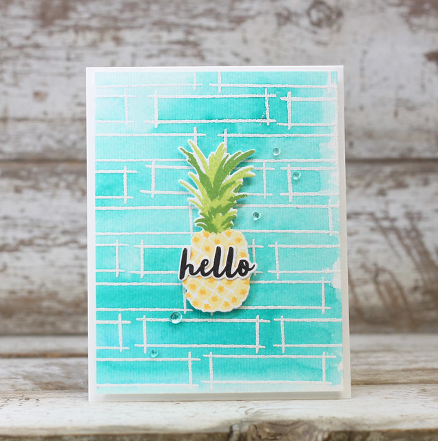
I didn't have the Outline stamp set she used so I heat embossed the frame from PTI Fillable Frames Additions 2 in white on watercolor paper. I wanted them to overlap a little for a more organic look to the background. I feel like purples are appropriate for sympathy cards so I added water to smears of Royal Velvet, Winter Wisteria, and Amethyst Allure on my craft mat and painted over the embossed watercolor paper. I added a layer butterfly to the center like Laurie's pineapple but didn't have a small diecut sentiment to use so I stamped it in one of the frames and added rainstones in a diagonal from the sentiment to butterfly and up - kinda like Laurie did. But in hindsight it might have looked better if the sentiment and rainstones were in the same direction as the paintstrokes. Didn't really think of it until now. Oh well. 


OK, that's it for me. I've got to pack as I am headed out for the weekend to meet up with my sister and her family at an amusement park. Hope you have a great weekend and stay cool. Thanks for popping in. 

Wednesday, November 25, 2015

PTI November 2015 Blog Hop

Its the 25th so its PTI Blog Hop day...but also means its exactly one month before Christmas! Yikes! 


The challenge photo for this month's Blog Hop is one of my favorites ever...it has my FAVORITE color combo (Simply Chartreuse, Hawaiian Shores, and Tropical Teal) and combines it with silver and white, and grey it seems which I am JUST seeing now for the first time. 


I was so inspired by this photo that I made four cards! First card uses Snowflake Flurries in the pretty color combo. I split the panel with the Sentiment Splits die and added in a sentiment from that set. 


Next two cards use the bold graphic stamp from Enclosed:Star. Same design, just different sentiment placement. I stamped it in the three colors and added a strip of silver card stock along the bottom to anchor the pyramids. I heat embossed the sentiment along the top of the pyramids. 


Hard to see the strip of silver along the bottom - better in this photo. Looks way cooler in person. 


This second one has the sentiment on the black banner. Lighting is a little dark...


 Think I like the one with the sentiment directly on the panel better.


Last one has a lot more color! I heat embossed butterflies from Life Is Beautiful in white along a panel and then sponged on Simple Chartreuse, Aqua Mist, Hawaiian Shores, and Tropical Teal to cover it giving it sort of an ombre look. I was trying to channel Laura Bassen's love of bold color with this one. 


Sentiment is heat embossed on white banner and I placed a white thread nest underneath. First time making a thread nest. 


Well that's it for me today. Thanks for visiting. Can't wait to see what everyone has made. 
And if you are celebrating tomorrow...Happy Thanksgiving!

Saturday, February 7, 2015

Papertrey Anniversary Part 1


February is one of my favorite times in the crafting world because its Papertrey Ink's anniversary month which means they are unveiling their plans for the coming year, unveiling new goodies, and have lots of contests going on.  You can check out all the fun HERE.

My first two cards were inspired by Maile Belles who is coming back to PTI as a stamp designer this year. Her cards are some of my favorites and always inspiring. I had so much fun looking back at her creations on Pinterest that I couldn't narrow it down to 1 so I made two cards.

I made a top fold card like she did and found that I really like this style of card. My card are usually side folded. Anyway, I heat embossed Mendhi Medallion in gold on a Tropical Teal strip. Before adhering the teal strip, I lay a strip of gold washi on the white card base and stamped the elegant sentiment from Thank You Kindly. My gold washi was very wide so I covered part of it with the teal panel. I really love how this turned out! And I must get more gold washi because its so beautiful.  You can find Maile's card that inspired me HERE. 


Next card is inspired by THIS Maile card. I guess I never saw this particular blog post but she has step by step photos in how to make this card with the cut out panel. Instead of using orange I went back to Tropical Teal. Looks so much better in real life because the white panel is on foam strips so its all raised above the bitty dot pattern. Finished it off with some black rhinestones. 


This card just reminded me how much I love this Life Is Beautiful set. No wonder its one of the top 8 best selling sets in PTI history. 


This last card is for the Day 1 challenge using this sketch and color inspiration:


For my card I used Ruby Rose flowers and added a strip of Simply Chartreuse bitty dot paper for the gap. 


Hope you are enjoying the PTI anniversary festivities. So much fun stuff going on over there. 

Saturday, January 10, 2015

Colour Me.....Plum!

Hi. Hope its warm where you are! Here in NJ, not so much. Still some snow on the ground and is a beautiful 20 degrees out. But sunny, so that's good.

Sharing a card I made for the Colour Me....Monochromatic! challenge this week which features a plum color. I've been working my way through Laura Bassen's Creative Color techniques class on Craftsy and she has inspired me to finally use the Tim Holtz ink blending tools I've had in my stash for ages. And now I think I'm addicted...


I blended Plum Pudding using a Studio Calico stencil. I didn't cover the whole thing, just wanted to create a subtle 'path' for my butterfly. 


And here's the card I made for the Craftsy class....


I was playing around with blending different inks together and decided to die cut the new Phrase Play out of the panel. Made the background from one of the Sparkle and Shine stars. 


Love how this turned out for my first time doing this type of thing. 

Hope you are having a great weekend! Thanks for stopping by! 

Wednesday, October 15, 2014

Colour Me....Subtle! #42


Happy Wednesday everyone! Its time for a new Colour Me.....Subtle! challenge and this week we are using the soft color combination of Island Indigo, Soft Sky, and Crisp Cantaloupe.  You are welcome to create anything with these colors and add in neutrals such as black, gray, white, kraft, and vanilla. 


For my clean and simple card, I layered two Life is Beautiful die cut butterflies in aqua mist with tropical teal on top and adhered them slightly offset so you can see the antennas. 


I layered the butterflies on a scalloped panel of melon berry dotted paper. Sentiment is from Everyday Photo Finishers die and stamps. I'd forgotten all about the Photo Finishers sets so it was nice to bring them out again! 


I hope you will play along at Colour Me this week. The Colour Me...! team has made some fabulous cards for your inspiration this week so head on over their blogs and check them out.

And our lovely featured designer for October...! 
Jen Mitchell

Looking forward to what you come up with in the gallery! Thanks for taking time to visit. Have a great week!