Tuesday, January 19, 2016

CASology #180 CLEAR

Happy Tuesday! There's a new CASology cue card revealed today: CLEAR. 


Once I heard the word, only one thing came to mind - clear cardstock! I have tons of it yet never use it so this was the perfect time to bust it out. 


My problem with clear cardstock has always been that adhesive is hard to hide. I wanted to solve this problem by heat embossing on the clear cardstock directly. I did try it on a scrap piece of acetate first so I knew how much heat to apply before the cardstock warped or melted. Tip: heat your embossing tool up for a minute before putting it near your cardstock (which is essentially plastic) and keep it several inches away so it won't melt. Definitely much further away than you would regular paper cardstock. I used PTI clear card stock which seemed much thicker and stronger than the thinner acetate pieces that many stamp sets come on. 


Also to limit the exposure to heat, I applied both the sentiment and confetti embossing powder before heating both up. Your clear card stock might be a little warped afterward - I just rested it under a heavy book for a day and it was fine. 


On the inside, I heat embossed gold confetti at the top of white card stock and the companion sentiment on the bottom. I matted the white on black cardstock so it would stand out against the clear cardstock a bit more. Love the combo of black and gold. 

The Design Team has a amazing and very different interpretations of CLEAR this week so be sure to check them all out! 


and our Guest Designer:  Natalia

Can't wait to see what you come up with...and be sure to check out this week's prize sponsor STAMPlorations.

Sunday, January 17, 2016

Create Along With Us January 2016


There were SO many fabulous DT creations with the last PTI release. But I was very inspired by this particular one by Lizzie Jones to create a card for the PTI Create Along With Us challenge:


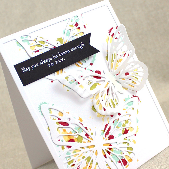
I loved how the dots of multicolored splatter were peeking out beneath the butterflies. Since I don't have this pretty little cover plate yet, I was inspired to create this card using the largest Beautiful Butterflies die as my focal point. I also used Drips and Dribbles to create the background in the same fun color combo Lizzie used.


I used foam tape to adhere the center of the butterfly on top of the dot splatters and pushed the wings back a little bit for added dimension. Sentiment is from Perfect Pairing. Love how it turned out...I'm definitely doing this again. Can imagine a set of cards with different color combinations....fun! 


First signs of snow here in NJ today....its a little long overdue but I'm still not ready for it. Hope you are having a great weekend. Thanks for popping by!

Friday, January 15, 2016

Geometric Confetti Cuts

Hi! I got to playing around with a very cool die in my stash - Reverse Confetti's Geometric Confetti Cuts. Two fun color challenges this week drew me to its modern mosaic look.


For the ColourQ challenge, I die cut it in 4 different colors - PTI Vintage Jadeite, New Leaf, Limeade Ice, and Silver. Then I pieced together the mosaic using Press N Seal which was VERY helpful in keeping the finished mosaic together and adding adhesive. All the cool shades of green with the silver are a surprisingly fabulous combination! Sentiment is from Altenew Label Love which I heat embossed in silver, cut out, and adhered with foam tape. I absolutely LOVE how it turned out. 


So I used the die again but this time for the fun bright color combination at The Paper Players challenge this week. 

Same process with this card except I used Press and Seal underneath the die and paper when I cut it so all the pieces would stay together in place. This made creating the mosaic much easier since I didn't have to look through piles for the right piece. Sentiment for this card is again Label Love but embossed in gold. I tried black at first but it didn't look right. This I found after 8 unsuccessful embossing attempts to get a good, clean sentiment strip. For this card I used PTI Pure Poppy and Raspberry Fizz and the turquoise color is Bazzill card stock. 


Thinking I'll make a few more of these with the leftover pieces while I have them out. Otherwise I don't think I'll end up ever using them again if I "save" them in an envelope for later. 

Thanks for popping in and hope you have a wonderful and crafty weekend! 


Tuesday, January 12, 2016

CASology #179

Happy Tuesday! Time for a new CASology cue card! 


This week we are challenged with OPEN. Lots of ideas came to mind with this word for me....open sky, opening a gift, open mind, opening a window.... but in the end I decided to go with lots of white OPEN SPACE in the true sense of CAS. 


I kept my focal point simple. I stamped my modern birthday greeting from MFT on the center of my white card base and also on a die cut balloon. I lined up the sentiment on the balloon on top of the card base and adhered it with foam tape so looks like it floats on top of the card.  


Please head on over to the CASology blog and gather some other inspiration on OPEN from the design team. Can't wait to see what you come up with! 


Sunday, January 10, 2016

Rainbow After The Storm

UGH. So frustrated yesterday. I had a few free hours to myself and finally got to my craft desk yesterday morning. Three hours later, I finished a few cards. Sounds good right? Well no, it wasn't. Everything seemed off....One card was just 'eh' and then I wrecked it trying to hand draw something on it. The other got an ink smudge on it after I finished it. And the last, my favorite one, while taking a photo of it, somehow got a water dot on the focal point which ruined it. Yikes! So basically I was left with nothing to show for three hours work and a VERY messy desk.  It was rainy and gloomy in NJ yesterday and I wasn't in the mood to fix or redo any of them so gave up. All I wanted to do was crawl back into bed! 
This ever happened to you?

I had gotten up early this morning so I went down to clean up the desk and try to salvage my projects. When I was done, the rain had stopped, the sun came out and I felt better because I had two finished cards - my personal rainbow after the storm!

First card was for the 2nd year anniversary celebration at Fusion challenge. Congrats Fusion challenge team on two years! I don't get to play with you often but am always inspired by your challenge.


I sponged some Tim Holtz Mustard Seed for a portion of a Heidi Swapp chevron stencil. I layered a big bold bloom from PTI Friendly Flowers along one corner trying to keep the sketch in mind. Sentiment is from Clearly Besotted.


My second card is inspired by the CAS(E) This Sketch challenge. I have been wanting to use the new PTI green Vintage Jadeite and paired it with a masculine color palette of Terracotta Tile, Enchanted Evening, and Kraft to create this thank you card for my daughter's male teacher at the end of the year. 


Thanks for letting me vent. Hope you guys are having a better weekend creatively than I did! :)

Friday, January 8, 2016

ColourQ #323

Hello friends! Thank you for all your warm wishes and messages regarding my CASology news. I'm still riding high with excitement.

I wanted to share a card I made for this week's ColourQ challenge which is such a refreshing change from the holiday colors we've seen these last few weeks.  Such a pretty color combination.


Trying to build up my stash of birthday cards this year so here's the first one. My card features the Simon Says Clear Stamps SENDING AND WISHING Better Together set. 


Got a busy weekend planned but hoping to get some crafty time in at some point. Enjoy your weekend and thanks for stopping by! 


Tuesday, January 5, 2016

CASology #179 and some EXCITING news

Happy New Year friends! I had a great week off with the family - holidays with the extended family, spent time with old friends, playing lots of games, and saw Star Wars Force Awakens twice! So nice to have a break from work and shuttling between school and extra-curricular activities.  


I am happy to start off 2016 by sharing the exciting news that I am joining the CASology design team. Can you say......AHHHH! I've always loved this challenge and am amazed by what the design team comes up with each week. I'm humbled to be amongst this group of creative gals!


So for the first challenge of the year, the cue card is SIMPLE. Simple is the core of CAS. 


I made this card as soon as I had heard the news about joining the CASology team. I wanted to make a card that showed how excited I am to be a part of this team. 


My card is a simple one-layer card using white card stock. I stamped my champagne glass (from PTI Propose a Toast) in the bottom corner to preserve white space and used a simple but striking sentiment from Reverse Confetti. Champagne and bubbles stamped in Brilliance Galaxy Gold for a hint of shimmer. 

For more inspiration on this week's Cue word SIMPLE, please visit the other DT blogs:

Thanks for stopping by! Have a great week! 

Monday, December 7, 2015

Colour Me.... #100 Challenge

Hi -

Been a busy week so haven't had a chance to make any fun, everything has been for a practical "need right now to give to XX" kind of emergency!

But didn't want to let it the last Colour Me.....Monochromatic challenge go by without playing. This card is for Hayley and Tara for taking a chance on me and inviting me to join the Colour Me...! design team last year. It was a great experience for me on a DT and they definitely challenged me with some of their color combinations. This card is to thank them for running 100 inspiring challenges and to wish them all the best in the future! xoxo


Have a great week!