Sunday, July 24, 2016

Masters Stamp-A-Faire #2


OK so let's just say that the Masters Stamp-A-Faire pushed me out of my comfort zone....

First card was inspired by Amy's Starry Night project. Here's the inspiration piece: 


Here's my take....I LOVE how it turned out even though it took me three tries to make a decent inked background that was usable. Think I'll try this technique again but stamp a nativity scene on the horizon. 


My second card was using Kay's Watercolor Like A Master tutorial. This too was my third attempt and while I'm comfortable enough for posting, I want to try again to make it better. I changed up the colors from Kay's example and I don't like the way the two inks Lavender Moon and Royal Velvet blended. Maybe too much contrast in the two colors. Also I realized afterward that Kay pulled additional color in between the flowers using the colors of the flowers. I used the colors of the leaves in between. Perhaps it would have looked better with more purple and pink in between. 


Will definitely try these both again. It was fun to get my fingers and craft space all messy....for one night. Not sure if this could ever be my regular thing though but I loved trying something new. 

Hopefully I'll get some time to try the other projects today but got some things going on with the kids. Thanks for popping in!

Saturday, July 23, 2016

Masters Stamp-A-Faire #1


I'm playing along with all the fun at PTI's Stamp-A-Faire festivities today. The Design Team is presenting projects inspired by the greatest artists in history. Lots of good stuff! 

My first card is for the Masters Color Recipes challenge where we had a variety of art & color palettes to choose from. Back in 6th grade, my art teacher gave us an assignment to select a work of art and try to replicate it. I chose a bold work of art created by Mark Rothko back then so I was excited to see one of his pieces among the choices today. Love the graphic nature of this piece as well as the bright colors. 


I created a square panel blended with Terracotta Tile, Orange Zest, Summer Sunrise, and Raspberry Fizz. I matted it on black cardstock before adhering to a white card base.  Sentiment from Graceful Greetings. 


Second card is for Danielle's Gilded Gold challenge. I didn't buy the Liquid Leaf in advance so I made a card embossed with gold leaves! I used one of the leaves from Mighty Oak and embossed a random pattern on Pale Peony. My only regret is that I embossed the leaves first before stamping the sentiment so I had to fit the sentiment in afterward. 


Hoping to create a few more cards after the kids go to bed tonight so I may be back with another post tomorrow. Can't wait to see what everyone is creating! Thanks for stopping by! 

Friday, July 22, 2016

Twas The Day Before....

Hello -

Weekend is here! I'm sharing a few cards I made last night before the madness of Papertrey's StampAFaire tomorrow. So excited for all the inspiration and fun PTI has planned.

First card is using this week's PTI Make It Monday technique Spritzed Stamps. I inked and spritzed the tree image from PTI Through The Trees in one corner of the watercolor paper panel. Sentiment is from KIS:Thinking of You. I added a tilted piece of Spring Moss underneath the stamped panel before adhering to Simply Chartreuse card base.


 I love how the water creates variations in color even though I only used Simply Chartreuse for the leaves.


Second card is inspired by the gorgeous color palette at ColourQ this week - Love the deep colors paired with gold. 


I masked off different sections along the frame and ink blended the challenge colors. Colors so vibrant in real life. Die cut THANKS from MFT. 


My last card was inspired by this week's fun sketch challenge at CAS(E) This Sketch:


I stamped the "arrow" image (don't know what else to call it) from PTI Teach & Inspire in Stormy Sea, Tropical Teal, Mint Julep, and Aqua Mist. I used my MISTI to stamp each color several times so each arrow's color was bold. Instead of a double ended banner like in the sketch, I used one of the Happy One-Liner dies in Stormy Sea on top of the row of arrows. I double mounted the stamped panel to highlight the gorgeous color palette. I contemplated stamping or heat embossing the word 'birthday' under the banner on top of the teal arrow but wasn't sure how it would stand out enough. Will probably add the 'birthday' before I send it out. 


That's all for now. Hope to be back tomorrow with more cards. Thanks for popping in! 


SaveSave

Tuesday, July 19, 2016

When the going gets ROUGH...

....you send a card! I find the most appreciated cards are ones that are unexpected and the ones that are sent to help someone during a rough time to let them know that they aren't alone and all will be OK. So that's what was in my mind when I saw this week's CASology cue word ROUGH.


For my card I used a Heidi Swapp triangle stencil to blend a few colors along the side of a card base. I choose some muted but happy colors and blended the ink so that there was some variance in color in each triangle. Sentiment is from PTI Perfect Pairing. I added a few coordinating enamel dots in a triangle around the sentiment. 

So where will ROUGH take you? Check out the creations of the fabulous DT for more inspiration! There are so many ways to go with ROUGH. 

Guest Designer:  Anna
Our fabulous sponsor this week: STAMPlorations

Can't wait to see what you come up with. Have a great week!
SaveSaveSaveSave

Friday, July 15, 2016

Happy Friday!

Hello friends! Happy Friday! Feels like its been a LONG week but I ended it with some crafty time so all is good.

First up is a card inspired by this week's ColourQ challenge. These colors are happy and bright so a birthday card was in order.


I used a Tim Holtz flower stencil and placed it on an angle on white cardstock and sponged the various ink colors onto the flower areas. I cut it off and added it to an Aqua Mist card base. Finishing touch was one of the  Everyday Happiness dies and sentiment. So bright and cheerful and perfect for my aunt's birthday. 


I've also been watching the videos in the Heat Wave online class this week. So many great projects but I'm finding the tips each teacher gives in the videos are so valuable. 


This first card was inspired by Kristina Werner's Basics video for an partially embossed one layer card. I used my favorite go-to PTI Snowflake Flurries set to form a sunburst border in Aqua Mist, Dark Chocolate, and Hawaiian Shores. I embossed in gold some smaller and partial sunbursts as well as the sentiment. Love the look of regular inked images with the gold embossing. Forgot all about this design trick until I saw Kristina's video and sample project (which I can't seem to link here) which is so gorgeous and CAS. 


And since I'm on an embossing roll, I made another card inspired by Kathy Racoosin's embossed resist lesson and Laurie Willison's PTI release gorgeous project below. 


Unfortunately I've been using a few sympathy cards lately so I made another one to add to my stash. 
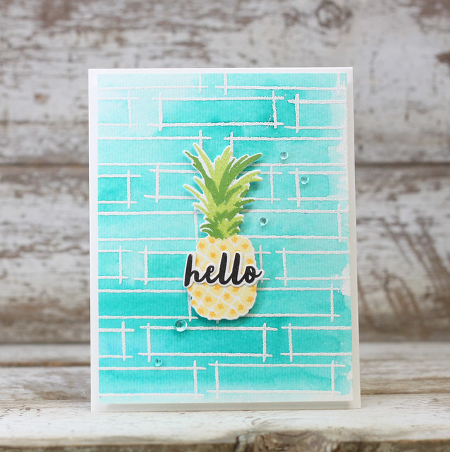
I didn't have the Outline stamp set she used so I heat embossed the frame from PTI Fillable Frames Additions 2 in white on watercolor paper. I wanted them to overlap a little for a more organic look to the background. I feel like purples are appropriate for sympathy cards so I added water to smears of Royal Velvet, Winter Wisteria, and Amethyst Allure on my craft mat and painted over the embossed watercolor paper. I added a layer butterfly to the center like Laurie's pineapple but didn't have a small diecut sentiment to use so I stamped it in one of the frames and added rainstones in a diagonal from the sentiment to butterfly and up - kinda like Laurie did. But in hindsight it might have looked better if the sentiment and rainstones were in the same direction as the paintstrokes. Didn't really think of it until now. Oh well. 


OK, that's it for me. I've got to pack as I am headed out for the weekend to meet up with my sister and her family at an amusement park. Hope you have a great weekend and stay cool. Thanks for popping in. 

Tuesday, July 12, 2016

CASology #206 - ART

Happy Tuesday! Hoping your week is off to a start and you are ready for a new CASology challenge. 


Going through my children's artwork from this past school school year has inspired to take art back to the basics with this sentiment from Reverse Confetti. I used a paintbrush stroke stamp from PTI Brushed Off and stamped a rainbow down one side of the card. Love how the array of colors! 


So many possibilities with this cue word! Hope you are inspired to create something and join us for a chance to win a prize from our sponsor this week: Rubber Dance Stamps


and of course, check out what the rest of the DT has come up with for ART. 

Guest Designer:  Lindsey
Looking forward to seeing your creations in the gallery. Thanks for stopping by! 

Sunday, July 10, 2016

ColourQ #349

Checking in with a quick card I made late last night. Hubby away in CA and I never sleep well while he's gone so I spend my late night hours cleaning or crafting until I'm so exhausted I can't help but fall asleep!

I used a paisley from new PTI Woodblock Prints stamps and created a background inspired by this week's ColourQ palette. I cut a split in the background to make room for a die cut sentiment from PTI.


Here's another card made with a simpler design. 


Thanks for popping in! Have a great weekend. 

Tuesday, July 5, 2016

CASology # 205 CHEVRON

Happy Tuesday! I feel like I'm all out of sorts because of the US holiday yesterday. Love a long weekend but hard to get back into the swing of things. Fun challenge this week - CHEVRON. Its a pattern that screams happy and fun to me with many ways to use it.


I used the PTI Chevron coverplate to die cut chevron strips in several bright colors. I adhered them to a black die cut circle to help their bright colors stand out. I die cut the THANKS in one of the coordinating colors and overlapped it on the card base. I like confining bright colors and patterns to a limited part of the card to preserve white space and keep things CAS. 


Check out what the rest of the design team did with CHEVRON this week -  

Come join us with this fun challenge. Just don't forget to keep your creation clean and simple! Thanks for popping in.